PeoplePerHour
Atomic Design System for the UK's #1 Freelancer Marketplace.
Roles
Director of User Experience and User Interface.
Director of Product.
PeoplePerHour were lacking visual consistency throughout the breadth of their Marketing, Platform and App. There was no continuity between design files and markup/CSS. Causing a massive drain on development and design resources and a far from optimal workflow for all involved.
PeoplePerHour was in dire need of a design system. I led the design team on this mission.
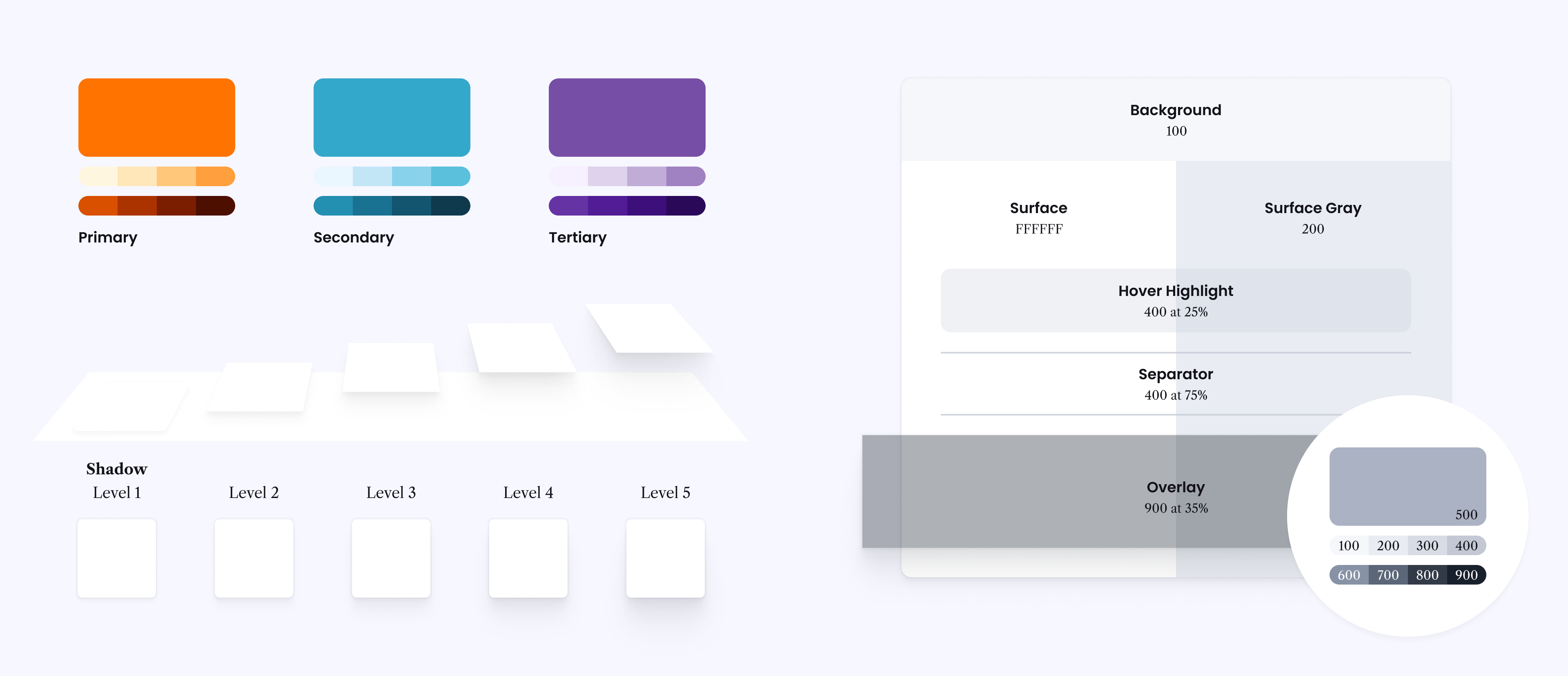
When kicking off the design of the PeoplePerHour Design System we began by discussing what was wrong or frustrating with the existing way of working. There were many obviously lacking elements, but the lack of consistency across the colour palette was a glaringly obvious place to start. Since that first ideation phase the palette has gone through numerous rounds of amends – growing, refining and then cleansing. By the end we'd created a comprehensive colour palette founded around PeoplePerHour's recognisable brand orange and extended into a more trustworthy territory through the use of blues and purples.
Another point of frustration was how many variations of grey were being used across the platform. Not only were 30+ shades of grey being used but they were being implemented with varying alpha levels  . We refined and refined our grey palette and now the PeoplePerHour interface is built with just six grey values. Five of these values are part of the defined grey palette, the sixth is the addition of white. Naturally, our five shadow depths also make use our grey palette — the darkest grey at 3% alpha
As an interface designer, having a clearly defined set of tools makes every job 100 times faster and naturally this speed enhancement is carried forward into the Style System used for PeoplePerHour's development. By creating Color Styles in Figma for each of these six shades and naming them by their exact use ('Background', 'Surface', 'Hover Highlight', etc.) we make the process of laying out a new interface like painting by numbers and remove any chance of our design system being mutated by an inexperienced designer.
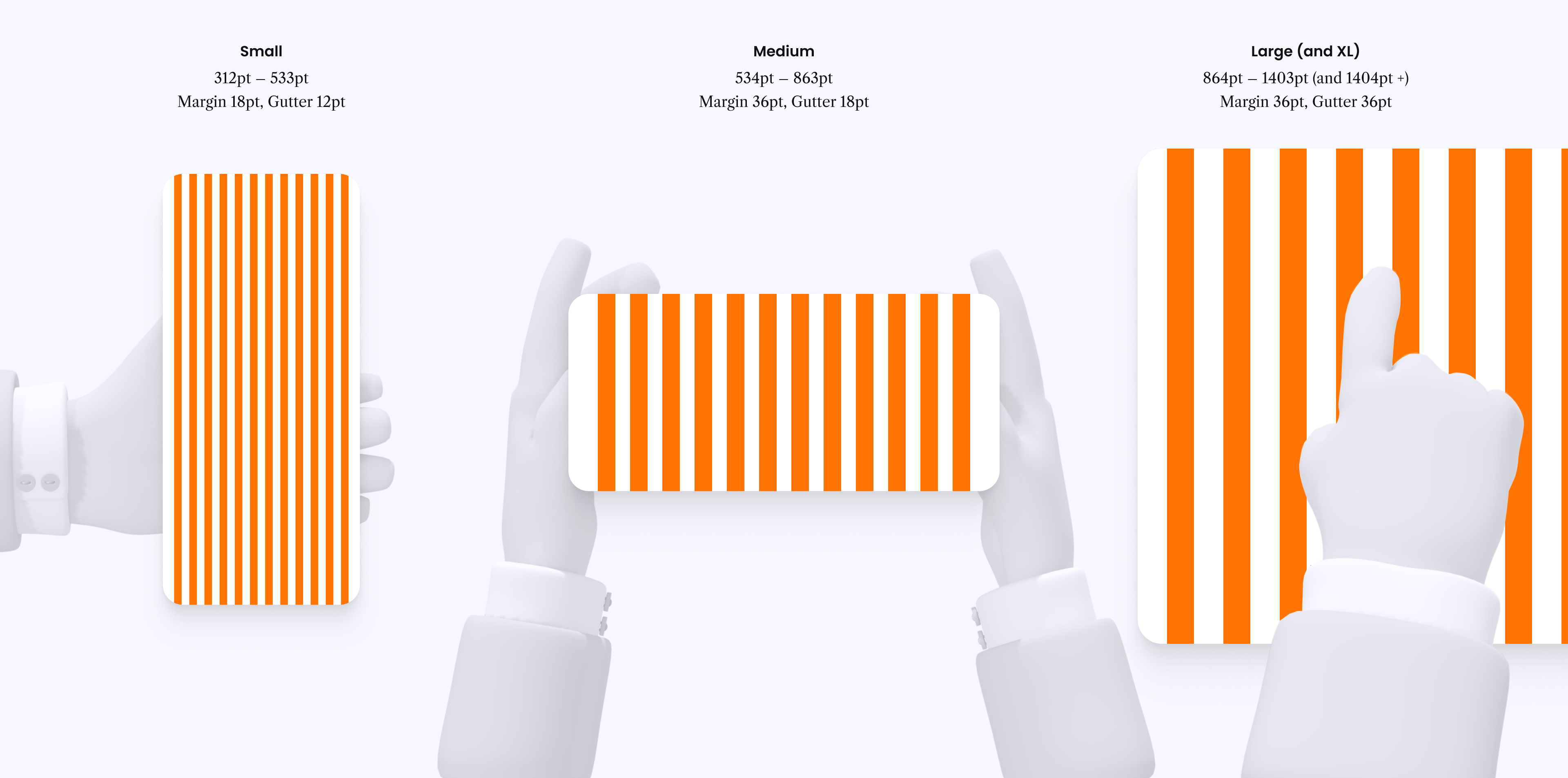
The next point of frustration was the lack of continuity between design files and the development grid. There were three different grids being used on production dependent on the age of the view and the technology being used to develop the frontend. We resolved this with a bespoke approach, rethinking the grid and stepping away from the old fashioned 'mobile', 'tablet' and 'desktop' mindset — after all, a modern iPhone in landscape was being served the 'tablet' view, and a larger iPad Pro gets served the 'desktop' view. We came out with three pixel perfect grids and breakpoints, simply named 'Small', 'Medium' and 'Large'. And a fourth breakpoint, 'XL', which shares its grid with 'Large'.
This is another example of removing friction between design and development. By removing redundant complexity, both teams (and the wider business) could talk the same language and communicate ideas far quicker.
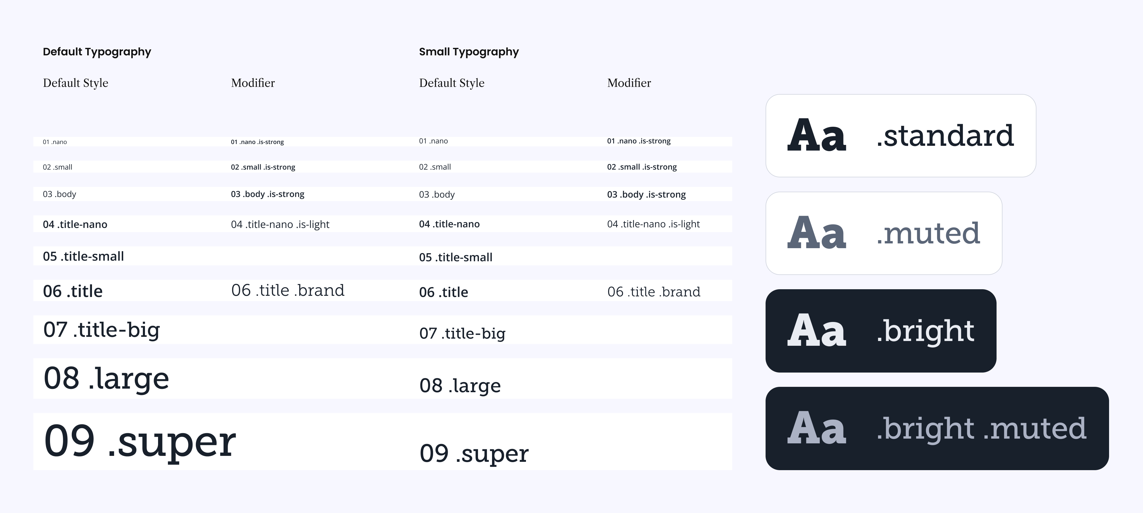
Historically, the process of testing a newly developed view took a long time, with a lot of back and forth between design and development. A lot of this time was spent discussing typography, "this line-height is wrong", "that font-size is too small", "the weight is too heavy", and "those elements should be in a lighter colour". Discussions like this were frustrating for everyone involved  . Our response was to simplify the typography right back by vastly limiting the typographic options.
The PeoplePerHour Design System has only nine font sizes. A developer should never have to add CSS to style any text. Instead they use one of nine classes within their semantic markup, '<h2 class="title">This is the title</h2>', would set the font, size, weight, line-height, letter-spacing and apply the default color. There are three legal colour modifiers '.is-muted', '.is-bright', '.is-bright-muted' to adjust the text colour when needed. We also allowed five of the nine styles to be modified via, '.is-strong', '.is-light' and '.is-brand' modifiers.
On top of all of this smartness, we also automated the font-size adjustment for smaller screens (the small breakpoint). So the developer never has to adjust font-sizes manually, it all just happens automatically. Resulting in less repeating code, quicker design, quicker development and far far speedier testing  .
.
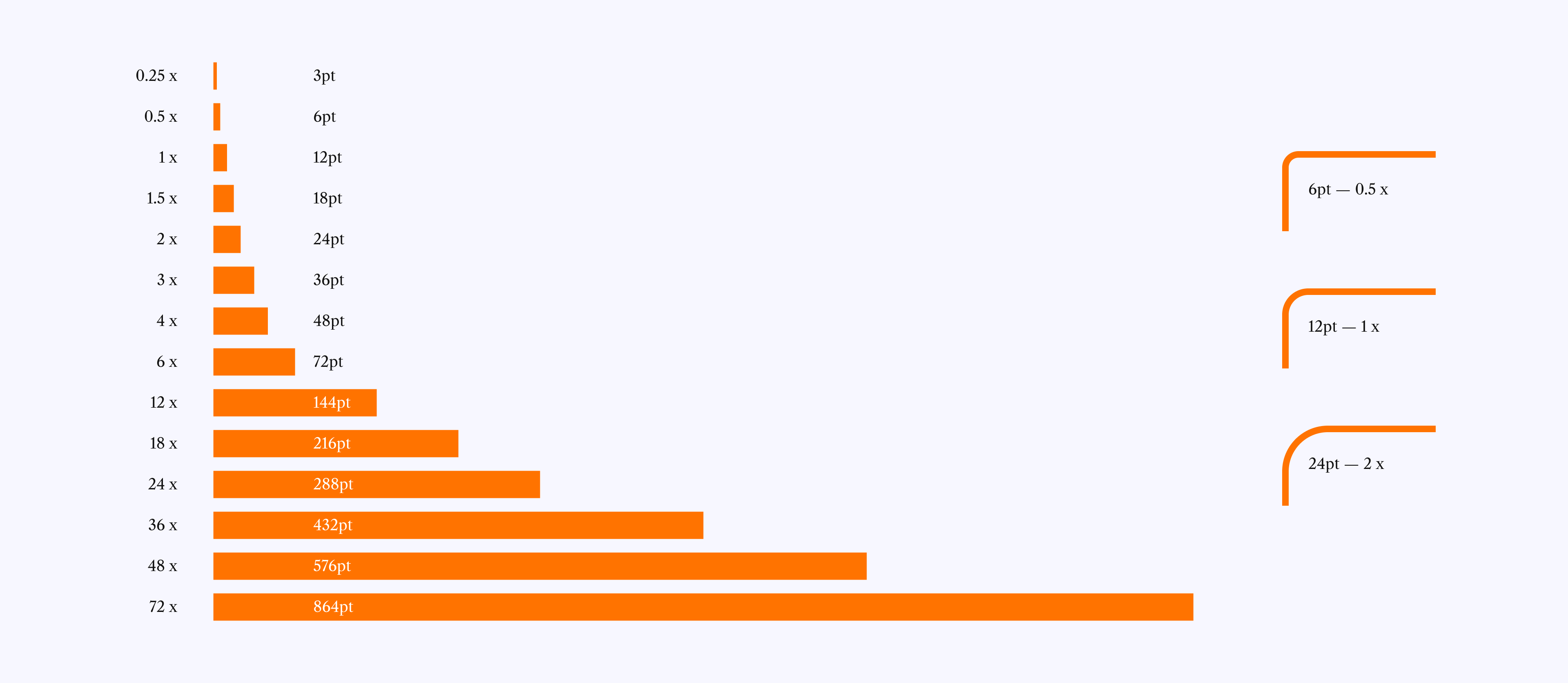
When designing an interface you should think about the rhythm of the page you're creating. A great way to achieve rhythm and balance is use consistent spacing and the way to create consistent spacing is to base all your measurements on a single value.
The PeoplePerHour Design System is based on 12pt. The grid, margin and gutters, the padding around elements. From the size of icons to the corner-radius of a button, everything stems from the number 12. This is another way to simplify decisions for the designer and to create consistency across the breadth of the platform.
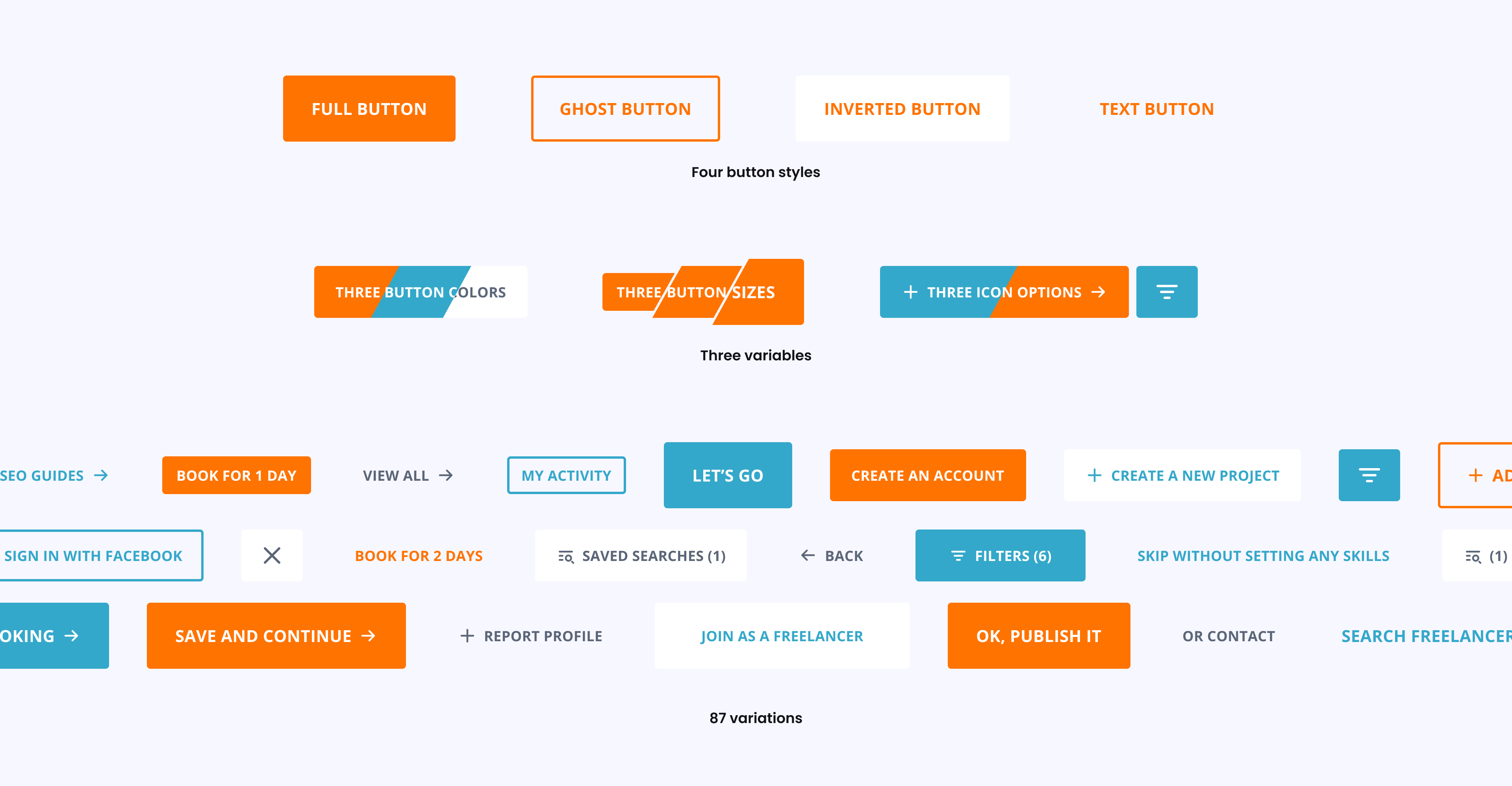
A key element in any design system is the button. I wanted our button component to be flexible and fuss-free, avoiding the faff of having to remember which type of button to use in different scenarios. So I created one single button component that can easily be adjusted throughout the design process with total flexibility. So when the design critique comes through that the button is 'too bold' or 'make it bigger' it's as easy as changing one variable in the properties panel in Figma. On top of that, every button is interactive and includes its focus, hover and disabled states.
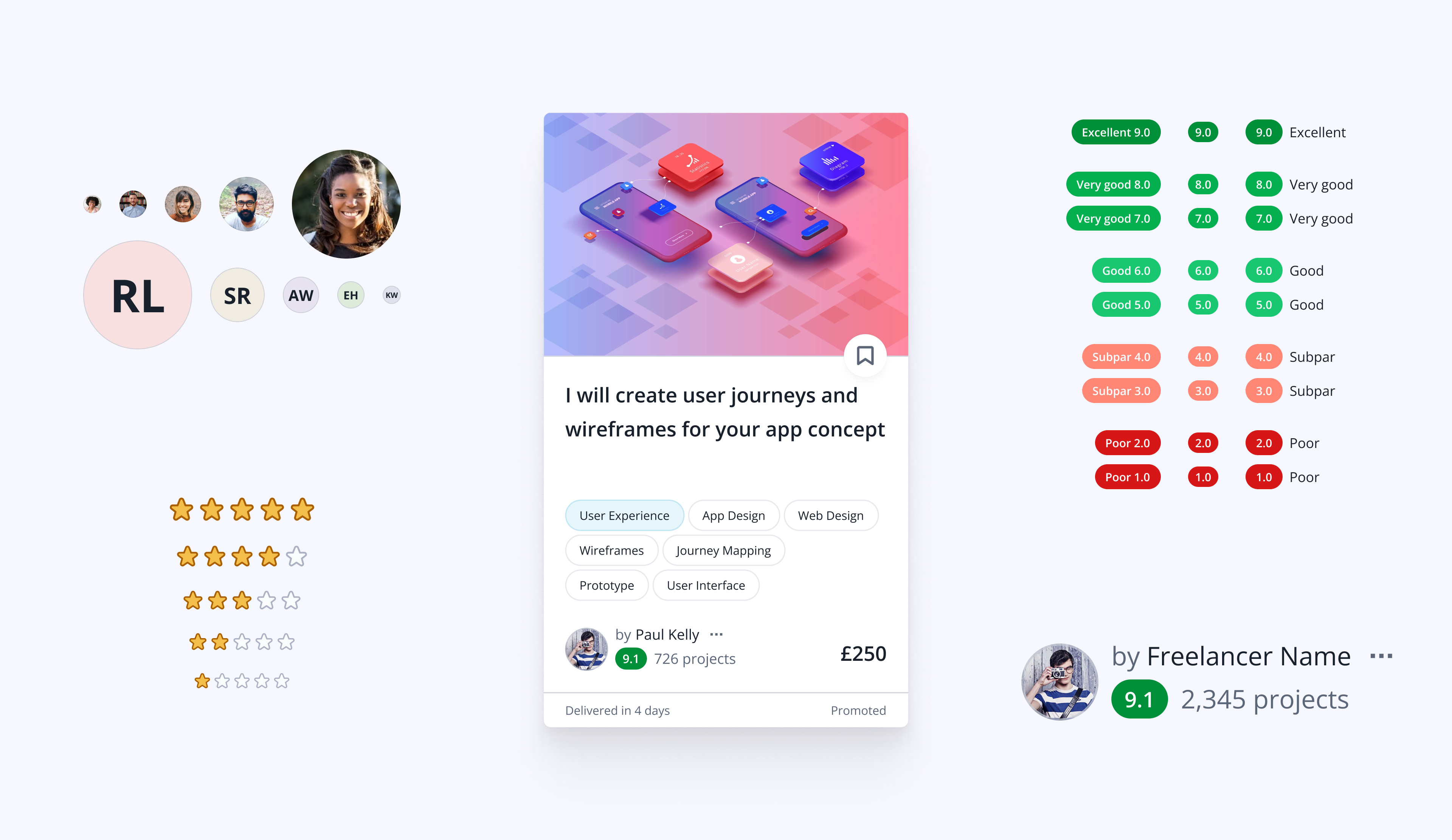
My favorite part of a design system are the molecules. Molecules are the helpers that speed up your day-to-day design tasks. Rather than having to layout 5 stars every time you need them, instead just make a molecule. Perhaps you need a default star size and a larger star size, so create a variable in the properties. Rather than have to remember all the available avatar sizes, create a molecule.
Molecules can also be composed layouts that would never exist on their own but get reused in multiple places — like the 'Freelancer Lockup'. Having this as a molecule saves the designer from ever having to think about how to represent the freelance user in any part of the system. Plus, the developer will now have more reason to create a reusable component.
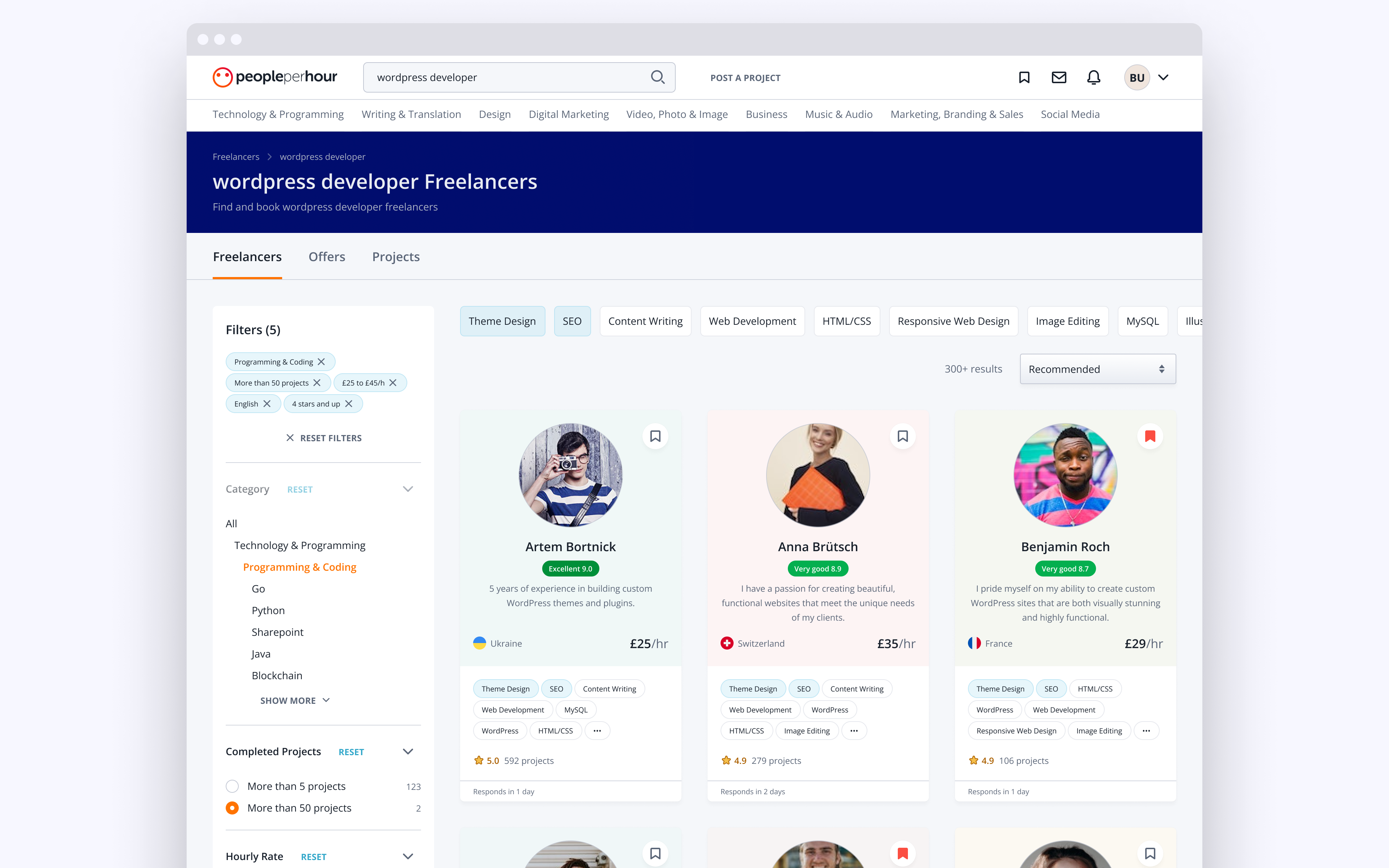
Eventually molecules start coming together to form organisms like the Offer Card. The only unique element in this card is the image, everything else is a molecule or predefined text style.
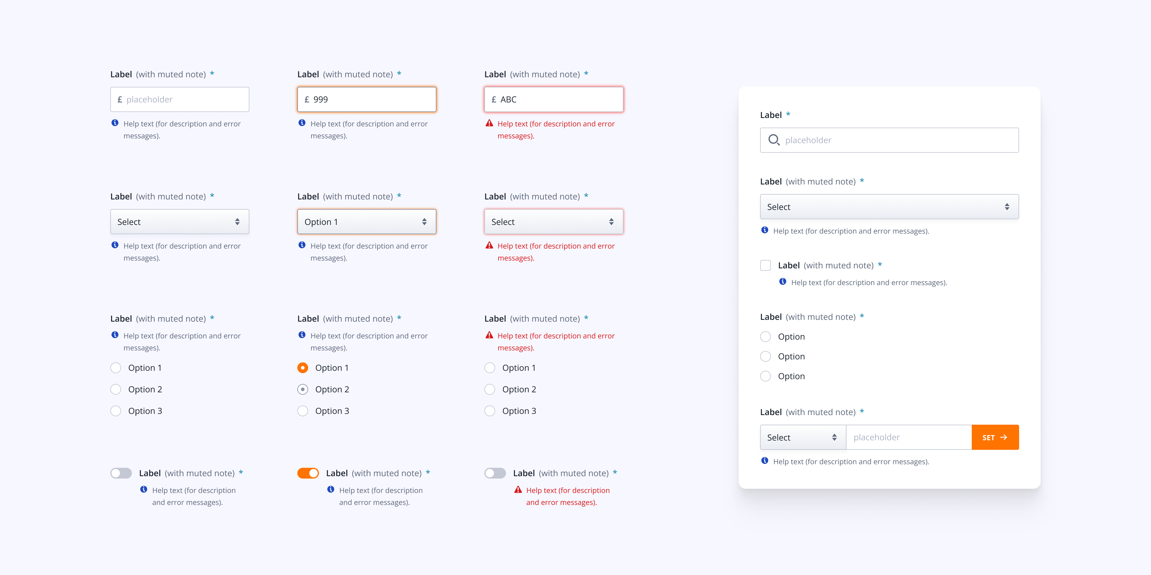
I love the challenge to bring multiple molecules together to create more intricate molecules, like form elements. For instance, every form element shares the same label and help text molecules, and they need to flex to the varying requirements of the interface — either responsively adapting the width or accommodating an extra long sentence. It's important that the design system replicates all possible interactions, like hover states, or error states, or hover-on-error states  .
.
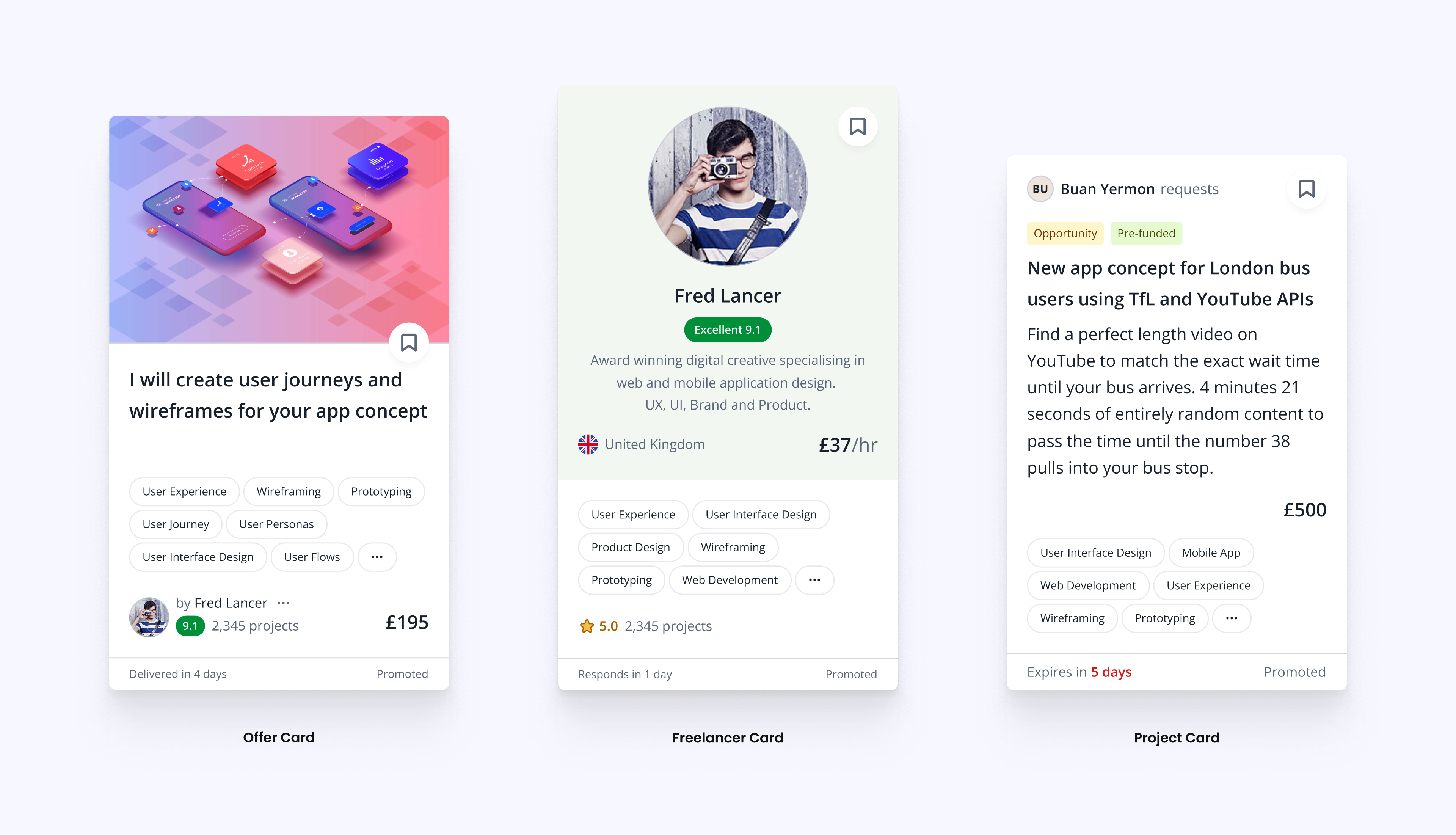
PeoplePerHour has three types of listing; Freelancers — where you look up freelancers with the skills you need; Offers — a marketplace where you browse fixed price deliverables pre-set by the Freelancers; and Projects — where Freelancers find briefs posted by potential clients. It was important to me that the cards in each listing struck a balance of looking unique – instantly recognisable as an offer/freelancer/project – whilst also being laid out consistently so the user isn't left hunting for the price or the save button.
With a well defined design system the whole business benefits.
1. A designer can pull together a new interface organism or a full view in very little time. Not only can they create it quickly, but their new view or component will look consistent and drop right in with the surrounding interface.
2. It's easy to demonstrate the design decisions that went into a new element to Stakeholders, so feedback becomes more structured.
3. Product Managers have access to the design system as a style and component library.
4. Development of new views is vastly simplified as so much of the design system has been created like-for-like into a frontend Style System and reusable components. And testing is infinitely simplified.
In my experience, the entire business has been positively enhanced by the rollout of the PeoplePerHour Design System.