LIZH Genie
Effortless recruitment for world class freelance creatives.
Role
Product Design Lead
Recognition
BBH founder Sir John Hegarty joined as chairman of GENIE.
Secured £1.75M in funding.
Fastest ever booking was made in just 7 minutes.
As the creative industry increasingly shifts towards freelance work over full-time employment LIZH set out to be more efficient.
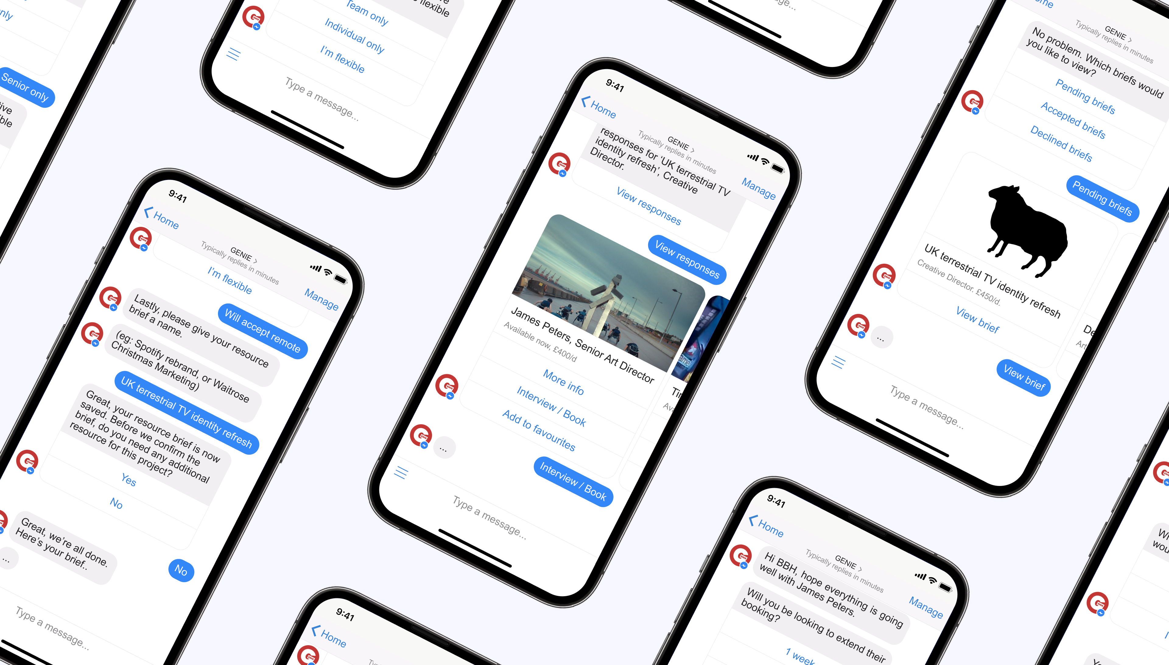
I designed a ChatBot (and full supporting system) to re-engineer their entire recruitment process. A platform that moved the existing human-led email and phone call model to a fully autonomous one. Whilst still allowing for human oversight to ensure that if the algorithm can't answer a question LIZH can always intervene.
Take a look MeetGenie.co or watch this Sky News interview.
Creative recruitment agency LIZH have been doing fantastic work placing and nurturing their roster of creative talent for over 30 years. Through this time, the way LIZH work has barely changed. New talent are met face-to-face to discuss their portfolios, opportunities and rates. New briefs from clients are taken via phone or email, digested and distilled by LIZH staff and then manually - via human brain - matched back to freelancers who could possibly do the work. LIZH then email or call each freelancer, explain the brief and ask if they're available — often to discover they aren't available.
This manual process and whole industry was ripe for a shake-up, and I jumped at the chance to get shaking.
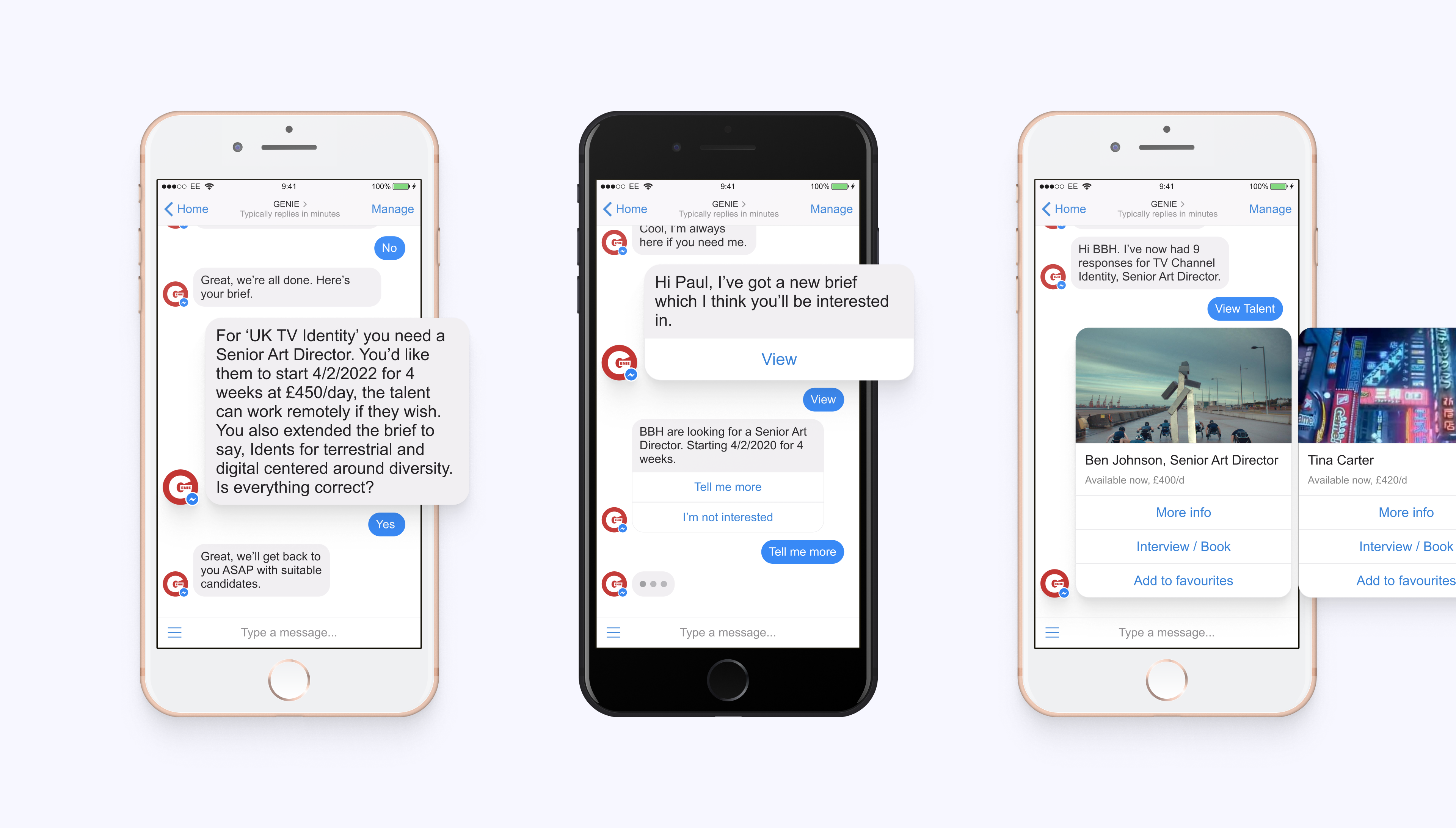
The brief became: how do we gather all the information needed for a brief in one go; perfectly match that to specialist talent who are definitely available; then get responses from talent without having to make multiple phone calls, leave complicated answerphone messages or maintain in-depth email threads. The solution: a ChatBot.
So where is this ChatBot going to exist? Our own app sounds good in theory, but creating the whole infrastructure and asking users to download a new product with no pre-formed opinions felt risky and a lot of work. So we looked to existing ChatBot systems and decided to use Facebook Messenger's ChatBot for Business Pages. This was beneficial for a few reasons. Obviously, billions of people have Facebook accounts and FB Messenger installed on their phones. Generally people who have FB messenger installed have notifications turned on. And FB provides a well developed and thoroughly tested API for us to integrate with.
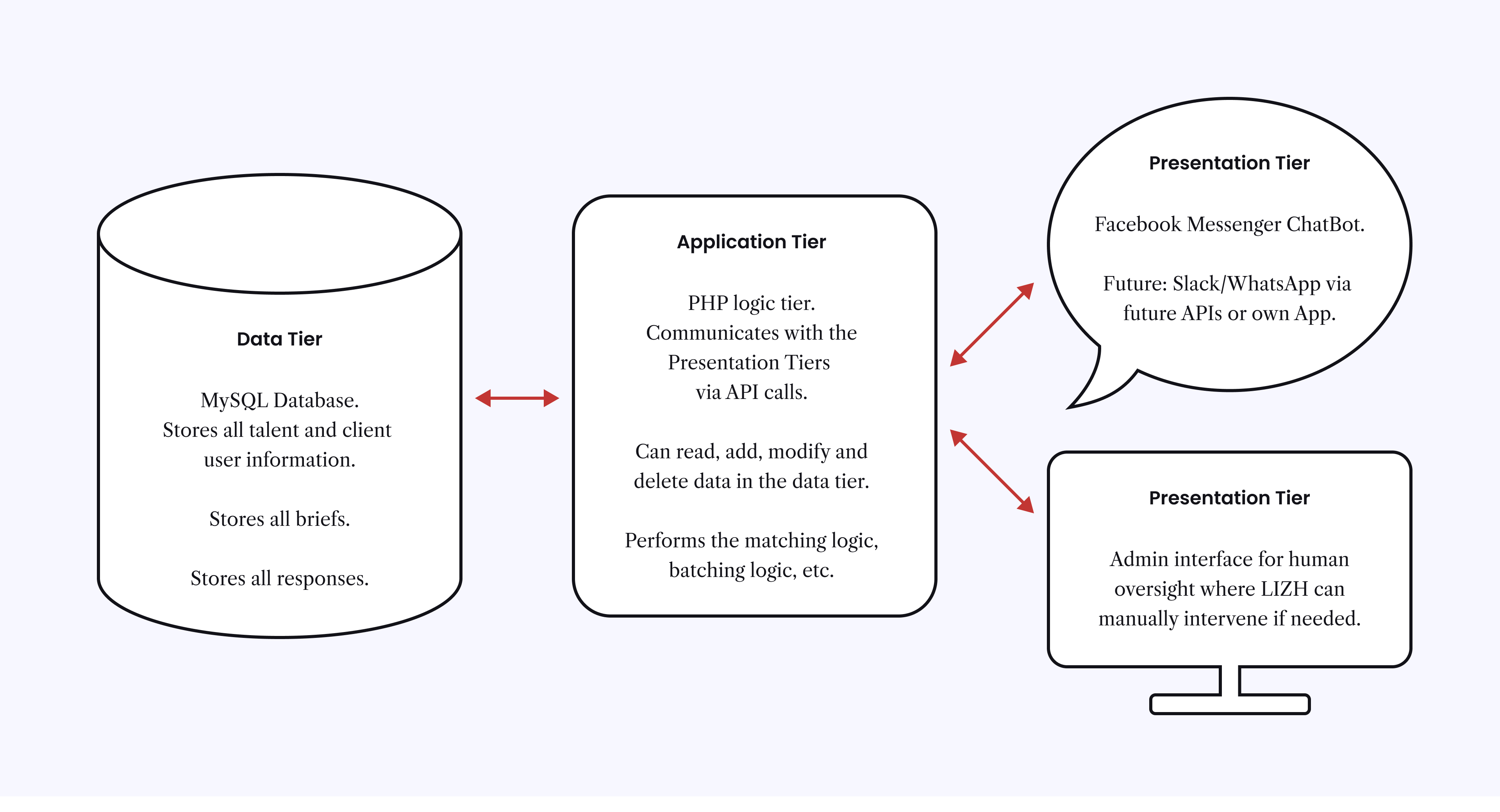
To avoid being stuck with this decision we opted for a Three Tier Architecture. Where we separate the database and logic from the ChatBot interface itself. This means that in the future we can expand the application into alternative messaging platforms (Slack/WhatsApp/etc) or even build our own app frontend.
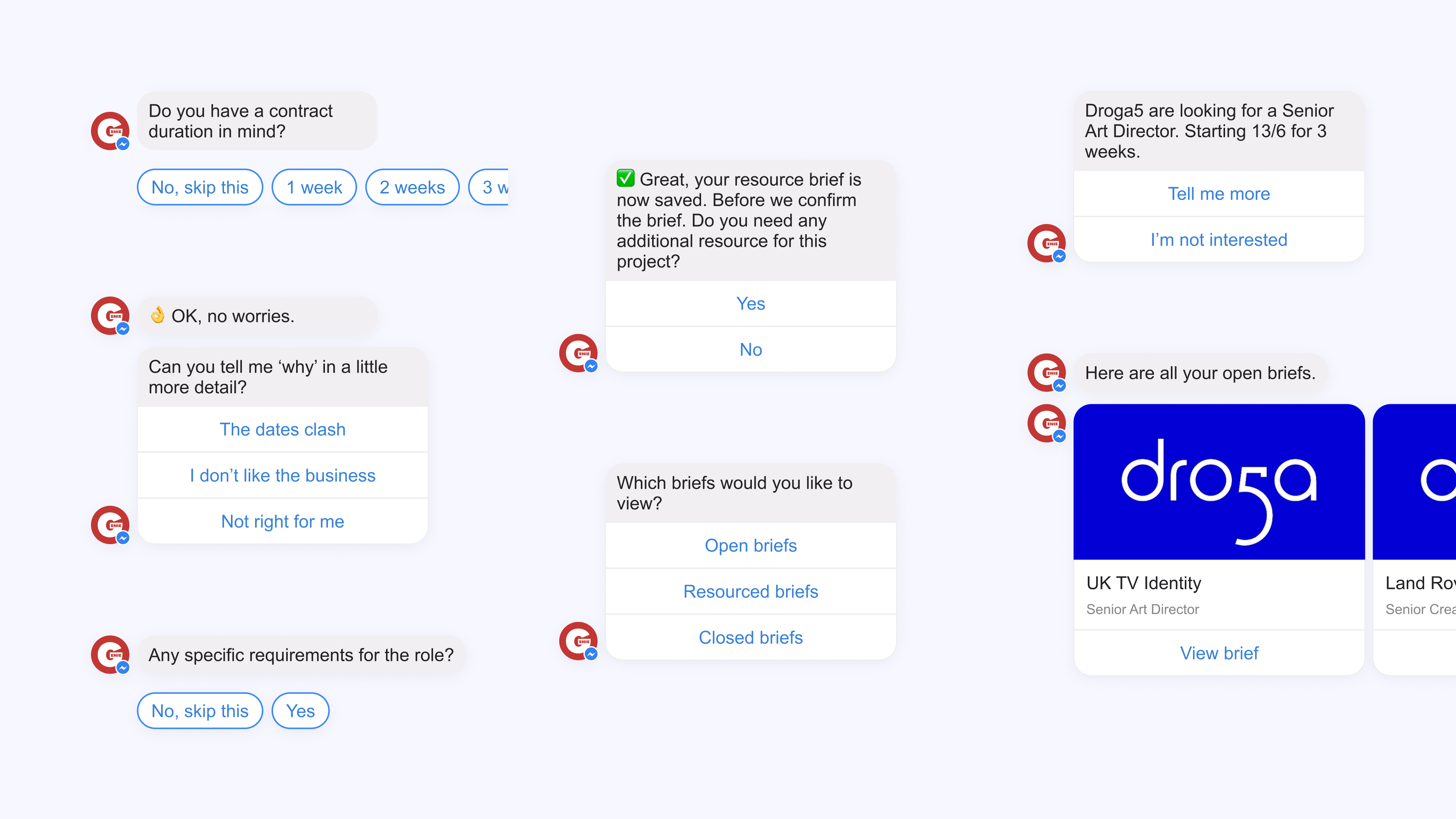
As a product designer I'm used to having control of pixels but when designing a ChatBot you rely on the UI of the chat platform. The quality of the user's experience is determined by the designer's ability to carry users through infinitely chained conversation flows. Always providing the user with access to the various actions they may wish to take. Whilst the brand identity and personality is based on the quality of the copywriting.
For this job, my role as a designer was centered on testing and perfecting every feasible user journey and ensuring that we always give the user a way to answer or ask in a way that feels obvious and natural to them.
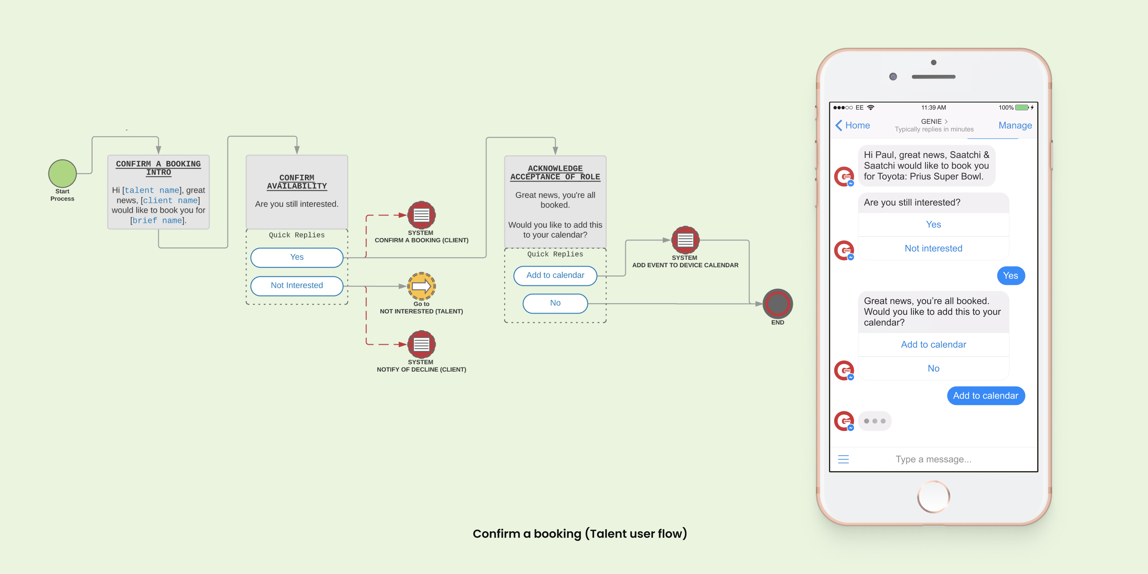
Most of my design time was spent in Lucidchart creating user flow diagrams. I created my own templates and tools to ensure clarity for me, stakeholders and the development team. Green dots mark where to enter each of the journeys. Yellow dots indicate that the user flow continues on another of the modular conversation flows. And red dots tell a developer where and when system events occur. I named every user flow diagram and gave every single chat box a unique name that was aligned with the development naming.
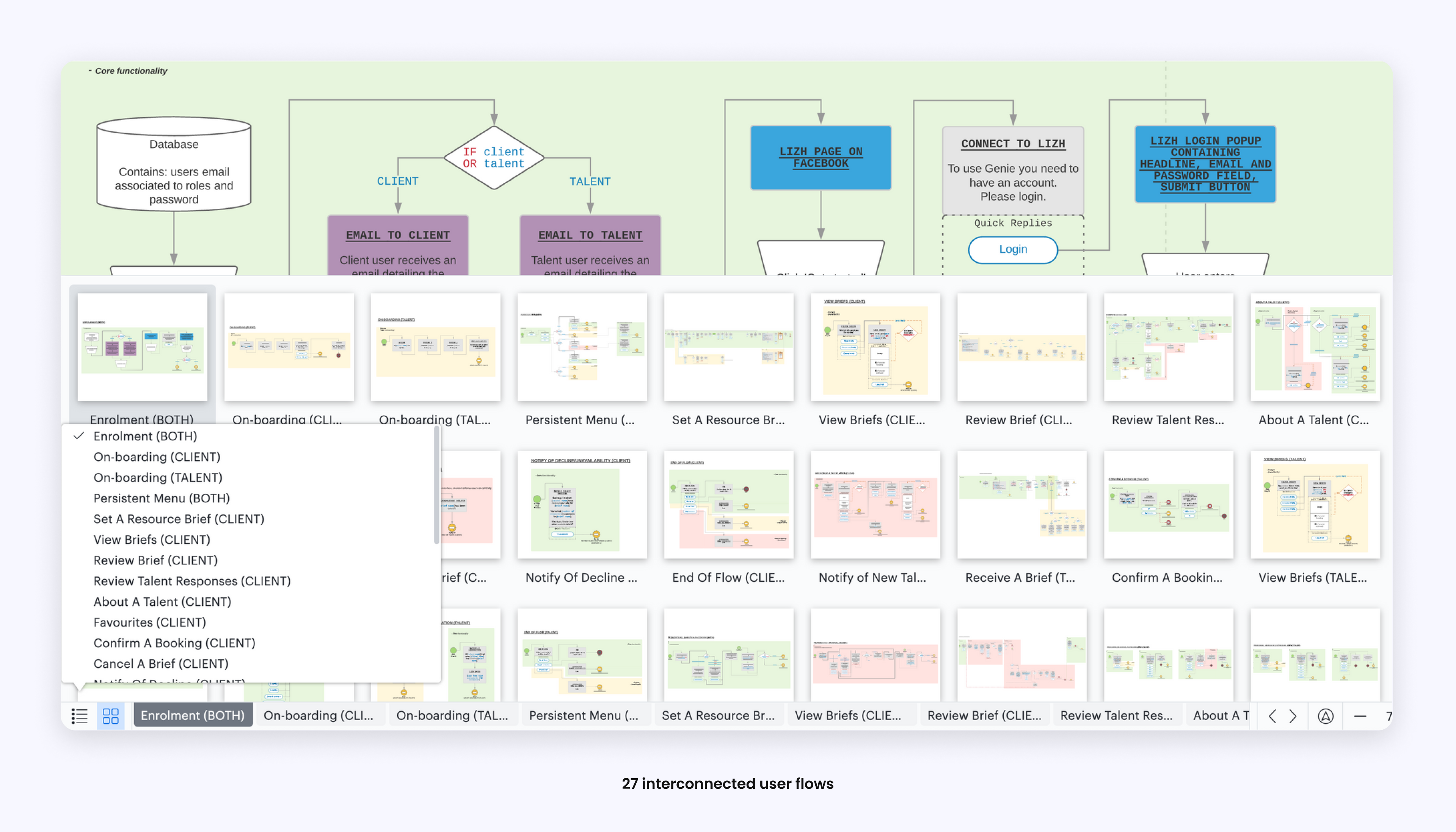
By the end I had crafted 27 unique user flows which could be chained in numerous ways to create a rock solid experience for the two user types – client and talent. As this was an MVP we were desperate to start testing these flows. One way to test was to interact with users via email, then let the flow diagrams lead the conversation and ask a few questions at a time via email and test the range of responses. Another way of testing was to record the audio of telephone conversations and then map the natural responses to our flows to see if any critical elements of the conversation were missing. Once we had a functioning ChatBot we were able to take telephone calls with users and run the ChatBot in our hands on behalf of the user. All of this testing and user feedback shaped GENIE into the end product.
I mapped out a phased release plan and developed a colour system to indicate this on the flow diagrams. Green for 'core product', yellow for 'features', and red for 'backlog'. Then we tested again, ensuring the core flows provided an acceptable experience.
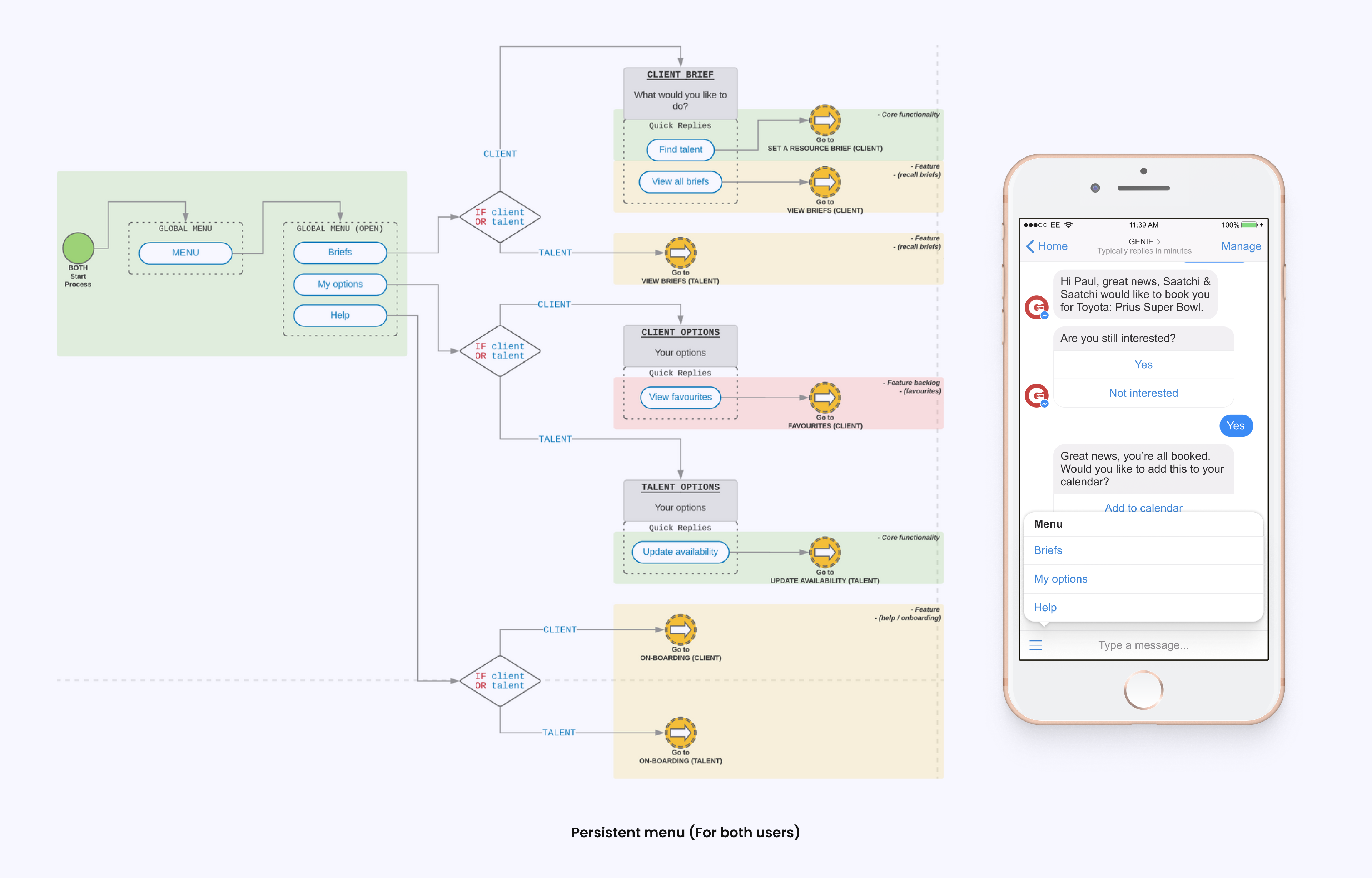
One challenge we faced was that there is only one ChatBot but two user types, Client and Talent. This wasn't an issue for any of the conversation flows because they are triggered from the Application Tier — via API calls to Facebook — which knows the user type from the database. The challenge was that the Messenger ChatBot interface has a menu button that could not contain a user aware list of options. The solution was to craft a set of option titles which were relevant to both user types then present the user specific options once clicked.
This was a fantastic brief and opportunity to work with an incredibly collaborative and enthusiastic team to create a truly unique product. I'm incredibly proud of the work we did to shape GENIE and I'm so pleased that the model has worked so well for the team and continues to grow.
